 I find the whole book marketing thing pretty hard. I’m creative when it comes to writing; not so much when it comes to trying to strategise advertising. I’ve never been one to toot my own horn. Time and time again, we hear there’s three magic ingredients to selling a book; Contents, Cover, Blurb. Well, there’s not a huge amount I can do about the CRYO contents because it’s written. And, from the feedback and reviews I’ve gathered, people like it. I’ve swapped the blurb around a few times, but I’m trying out a new cover, once again. I’ve had a few comments that the cover’s scary and implies horror. Also, that it’s too cartoony. I’ve looked down the current top lists for science fiction and dystopian and yes, there’s nothing like my cover out there. But perhaps this is where uniqueness is a flaw; perhaps I need to gel with the crowd more and give people something they’re used to.
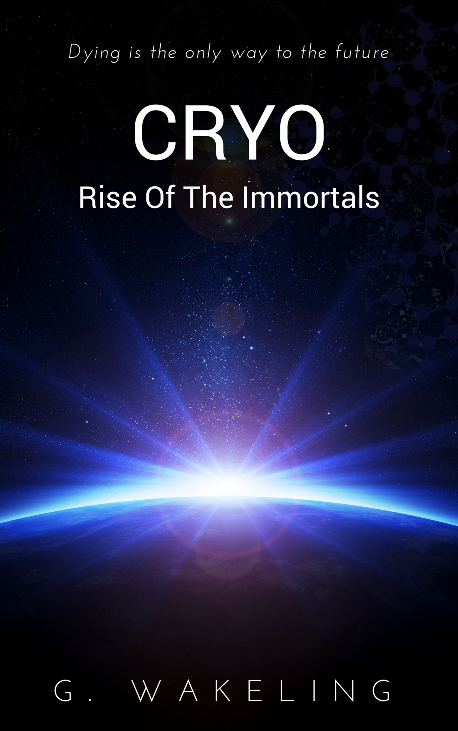
With that in mind, I’ve created a new and VERY simple cover. Literally, it’s a slightly altered photostock image with clear text added utilising canva. It’s not yet appeared on Amazon, but if you use the ‘Look Inside‘ feature, you’ll see it’s now inside the book.
If there’s one thing I’ve learned over the years, if something isn’t working, change it. It can be hard to let go of covers, text etc you’ve worked hard on, but if it’s not actually bringing in sales, you just can’t hold on it. For now, this is a test run – I’ve only applied it to Amazon to see if it’ll have any effect. What do you think? More sci-fi than the previous cover? More eye-catching? Or, perhaps you don’t like it as much?

I can’t find the old cover on Amazon. A search under your name only bring up the Evil books plus a whole bunch of nonfic theology stuff.
Oh, wait. It’s under Geoffrey Wakeling.
TBH I prefer the old one. You said you threw this together with some free software and I think it shows. The image is OK, but the typography is meh. Three different allcaps fonts makes for a dog’s breakfast of typography. Your name is not centered. With a simple image like that, the typography has to be really strong.
Thanks Patty,
As I did say; not very good with this whole stuff. I still have the old ones so can upload whenever. I’ll do some stuff with the typography and correct it – thanks for point ing that out. However, it can’t hurt sales because at the moment I have NO sales!